SagaV: Designing the Pour
Saga V is a premium mocktail brand created for adults ages 21–40, designed to deliver a high-end experience through cohesive brand identity, packaging, and storytelling. As sub-team lead for 3D mockups, I used Autodesk Maya to design and render bottle prototypes, initially exploring a square whiskey-inspired shape before pivoting to a round design after testing revealed pouring and usability issues. The final tarot-inspired round bottle featured textured glass for grip and elegance, aligning with the brand’s premium vision while ensuring functionality. Through research, iteration, and collaboration, the project successfully fused technical craft with brand strategy, resulting in a refined, market-ready concept that stood out in a space with few premium mocktail competitors.
A New Contender
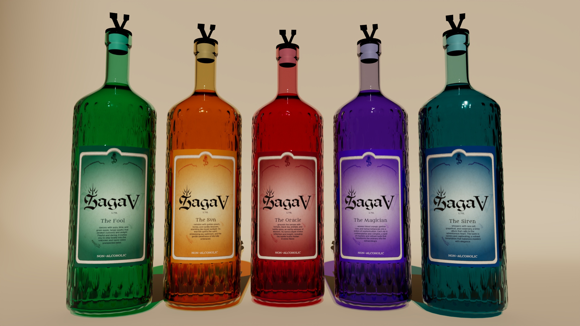
Saga V is a premium mocktail brand created for adults ages 21–40, designed to deliver a high-end experience through cohesive brand identity, packaging, and storytelling. Inspired by a tarot card theme, the mocktail delivers a whole experience to consumers that goes beyond a simple party drink. Five colorful flavors have unique tastes, a premium unboxing and handling experience, and custom cards that reveal themselves on the bottle as the drink is emptied.
Bottles Away
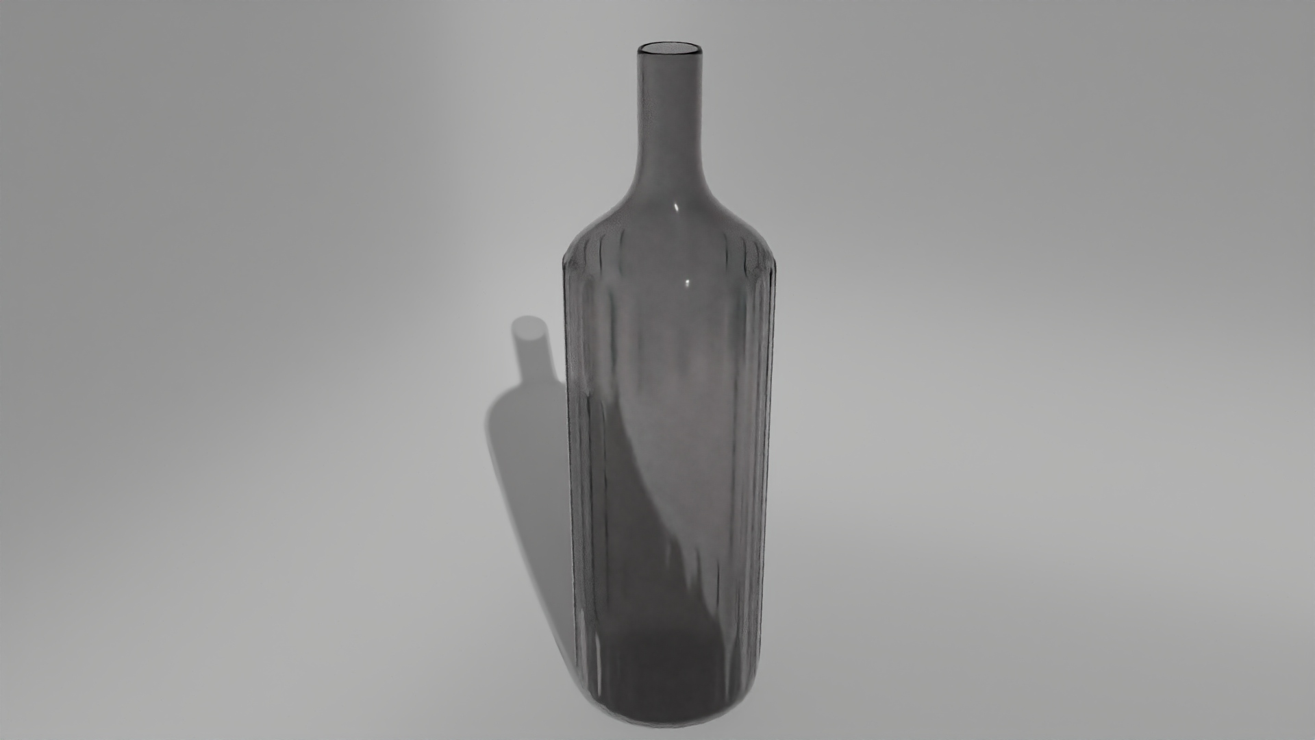
As sub-team lead for 3D mockups, I used Autodesk Maya to design and render bottle prototypes, sculpting each concept iteration from scratch. The initial idea was to explore a square ‘Jack Daniels’ inspired bottle, so after researching advanced modeling, glass texturing, and coloring, I produced an initial square-bottle concept rendered with high-quality Arnold shaders at 1080p.
Square One
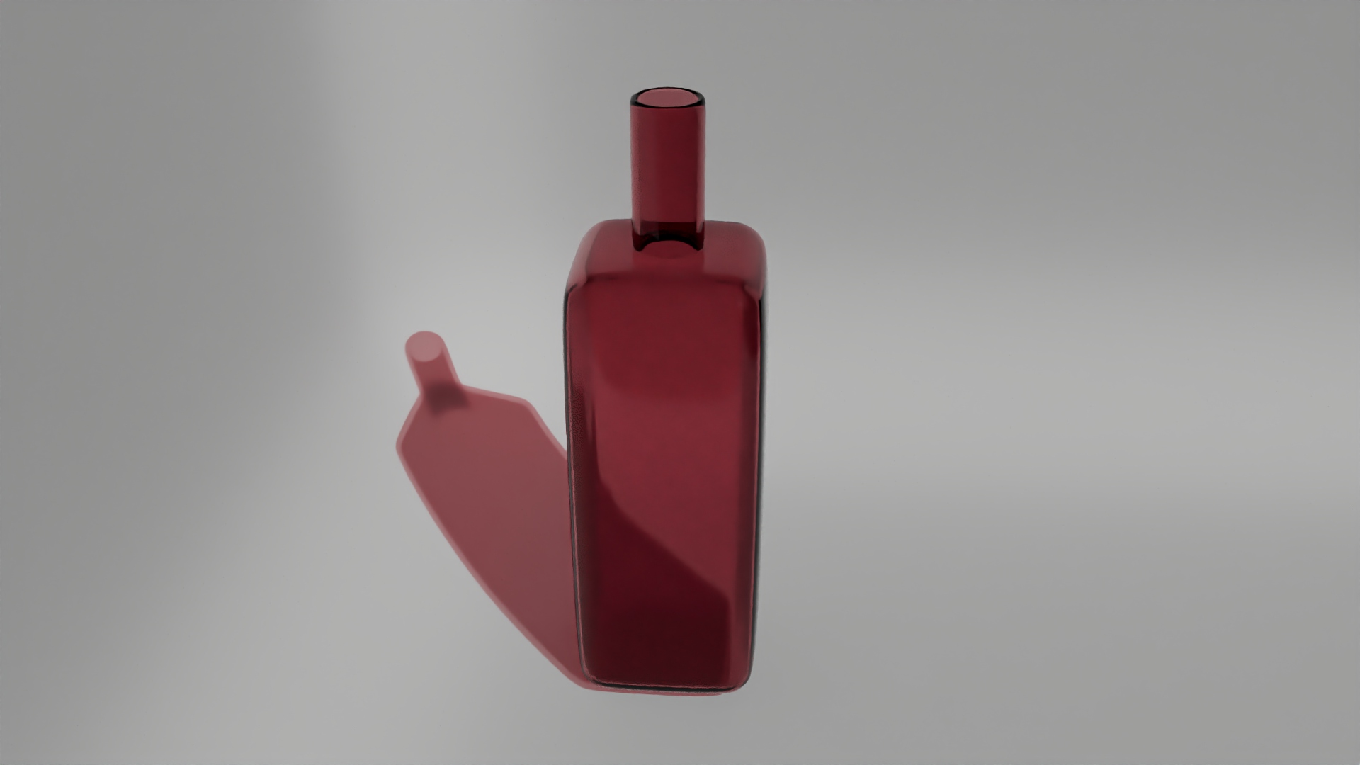
As we went through the first round of revisions for our concepts, I received a stakeholder feedback that they were not aligned with the square shape of the bottle. Concerns raised were regarding tough handling, and unfriendly pouring experience with the drink getting stuck around the top part of the bottle. After a team discussion regarding the feedback, we decided to move forward with a round shaped bottle. This meant that I had to scrap all my square shape explorations and start from scratch with a round shape for the bottle.
Hold on Tight
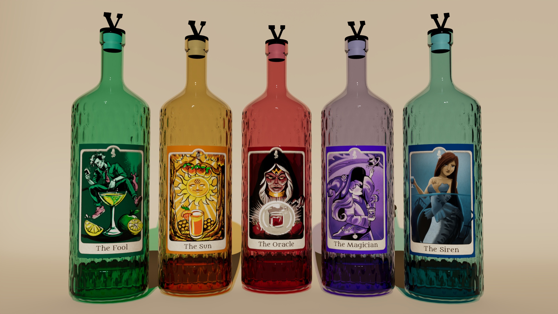
While exploring round shapes and iterating on new concepts, observations were made by the team that plain round bottles are too common and do not deliver the premium feel of the brand concept. Thus I made additional explorations and iterations to the exterior portion of the new rounded shape, to add texturing to the surface. After exploring various vertical ridges, and square engravings, I settled on small oval indents on the bottle. A render pass was made for this concept and was approved by my team. This successfully communicated the premium look while also being practical with ease of pour, and the indents providing a good grip for handling as well.
Texture That Talks
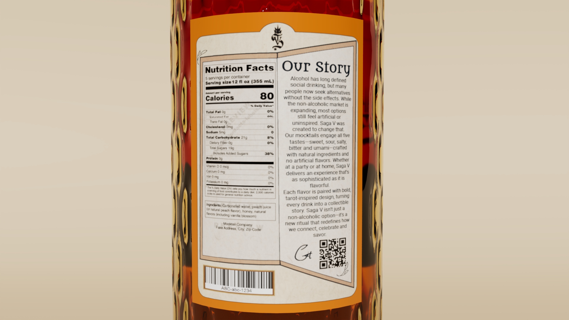
While modeling the oval shapes on the glass exterior, I made sure to leave out some smooth surface areas on the front and back of the bottle for the front and back labels respectively. Once the labels were finalized by my team, I UV mapped the surface areas and applied the image textures appropriately finishing a complete bottle look.
Cap it Off
Next steps were to model and texture a bottle cap and add liquid volume, the latter of which was done with ease as I had experience with liquid modeling. For the cap, since my team had already conceptualized a few different iterations, I chose a rubber style slip-on cap to work on, and wrapped it up with a brand inspired ‘V’ symbol modeled on top of the cap. This cemented the premium feel to the bottle while portraying elegance and sophistication.
Ready for Prime Time
Final works for my deliverables included different bottle and liquid colors to match each of the five tarot themes, then bottle positioning, lighting and camera setup in the virtual environment to render out high quality mock images that were production ready. Through research, iteration, and collaboration, the project successfully fused technical craft with brand strategy, resulting in a refined, market-ready concept that stood out in a space with few premium mocktail competitors.